In Use - Project

Insight Body and Mind

Allusion colour Sesame by Zepel | Photograph by Timothy Kaye

Allusion colour Sesame by Zepel | Photograph by Timothy Kaye

Sesame

Zepel

Seeking to expand their practice in a union of mindful movement and psychological care, Insight Body and Mind enlisted Melbourne-based design firm Biasol to elevate both the interiors and the visual identity of the brand.

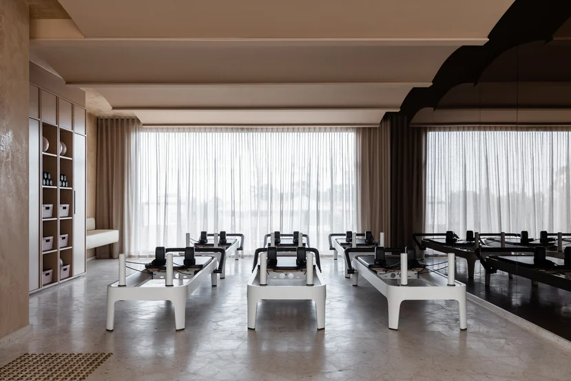
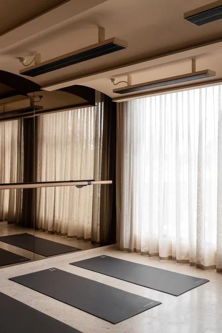
Conceived as one to ensure a fully immersive and transcendental spatial journey, the branding, interiors, and services establish a new benchmark in their field whilst empowering holistic change through yoga, barre, and Pilates.

“The experience begins on the ground floor with calm, grounded consulting rooms and flows upward to the light-filled movement studios across the first and second floors,” explains Jean-Pierre Biasol.

Sculpted curved forms, graphic stone surfaces, and an interplay of light evoke a sense of flow, energy, and life – in turn emphasising Insight’s unique point of difference.

“The colour palette is composed of two distinct yet complementary schemes,” notes Jean-Pierre. “We selected Zepel’s Allusion fabric in Sesame and Silver to complement and elevate the tonal palette of each floor.

“These sheer fabrics bring softness and diffusion to the natural light, enhancing the calm, restorative atmosphere we aimed to create across both the psychology and movement spaces.”

“These sheer fabrics bring softness and diffusion to the natural light, enhancing the calm, restorative atmosphere"

Jean-Pierre Biasol
Allusion colour Sesame by Zepel | Photograph by Timothy Kaye

Allusion colour Sesame by Zepel | Photograph by Timothy Kaye

Sesame

Zepel

The psychology-focused reception, waiting areas, and consultation rooms are found on the ground floor, where mid-grey Venetian plaster walls convey a sense of calm professionalism. Acting as a muted backdrop for the dramatic teal of the Cipollino Ondulato Rosso stone surfaces.

“In contrast, warm peach tones infuse the movement studios above with softness, serenity, and a sense of humanness.” Where peach-toned Venetian plaster is applied to the walls of the first floor, the palette softens further on the second floor into pale shell tones, paired with a Fibonacci Softshell terrazzo floor.

By designing both the interiors and the branding, Biasol ensured the distinct functions and operations of both psychological services and movement practices seamlessly embodied Insight’s progressive approach to wellbeing.


Products used:

Allusion in colours Sesame and Silver by Zepel


Interior design: Biasol

Photographer: Timothy Kaye

Allusion colour Sesame by Zepel | Photograph by Timothy Kaye

Allusion colour Sesame by Zepel | Photograph by Timothy Kaye

Sesame

Zepel

Allusion colour Silver by Zepel | Photographs by Timothy Kaye

Allusion colour Silver by Zepel | Photographs by Timothy Kaye

Silver

Zepel

Silver

Zepel

Allusion colour Sesame by Zepel | Photographs by Timothy Kaye

Allusion colour Sesame by Zepel | Photographs by Timothy Kaye

Sesame

Zepel

Sesame

Zepel

Allusion colour Sesame by Zepel | Photograph by Timothy Kaye

Allusion colour Sesame by Zepel | Photograph by Timothy Kaye

Sesame

Zepel